Table of Contents
- Why Ocean Wall Art Belongs in Your Living Room
- Ocean and Coastal Wall Art Styles That Work in Any Living Room
- Beach Canvas Art: Choosing Materials, Finishes, and Framing
- How to Hang Canvas Art: Sizing and Placement for Living Rooms
- Coastal Gallery Wall Layout: Multi-Piece and Panoramic Sets
- Color Palettes: Matching Ocean Wall Art to Your Existing Decor
- Styling Ocean Wall Art for Renters, Airbnb Hosts, and Offices
- Conclusion: Bringing the Calm of the Ocean Home
- Frequently Asked Questions
Last Updated: October 9, 2026
Why Ocean Wall Art Belongs in Your Living Room
Ocean wall art for living room spaces does more than fill a blank wall, it changes how a room feels the moment you walk in. At Cool Art House, we help renters, Airbnb hosts, and business owners choose calming seascape prints.

The living room is where you unwind and host friends. A shoreline or wave scene supports that mood in a way abstract prints rarely do: soft blues, sand tones, and gentle light pull the eye toward the horizon.
Below, we break down the styles, sizes, materials, and layouts that work in real living rooms.
Ocean and Coastal Wall Art Styles That Work in Any Living Room
Coastal wall art covers a wider range than most people expect. The right style depends on whether you want a bold focal point or something quiet.
Waves, Seascapes, and Beach Sunrise Scenes
Waves and seascapes are the most popular choice for living rooms. A single breaking wave or calm horizon creates movement without clutter. Beach sunrise and sunset scenes add warmth through golden tones that suit warm wood floors or cream walls, while panoramic prints stretch a seascape across a wide wall above a long sofa.
Marine Life, Coral, and Nautical Charts
Marine life prints bring color and personality: coral, fish, and seashell studies suit coastal-themed rooms and children's play areas. Heron and shoreline bird prints feel quieter and more traditional, while nautical charts add a graphic, structured look that pairs well with navy, white, and natural wood. Choose these when the rest of the room already leans coastal.
Beach Canvas Art: Choosing Materials, Finishes, and Framing
Beach canvas art is only as good as what it is printed on. The material changes how the colors read, how the piece ages, and how much maintenance it needs.
Stretched canvas: the default for living rooms
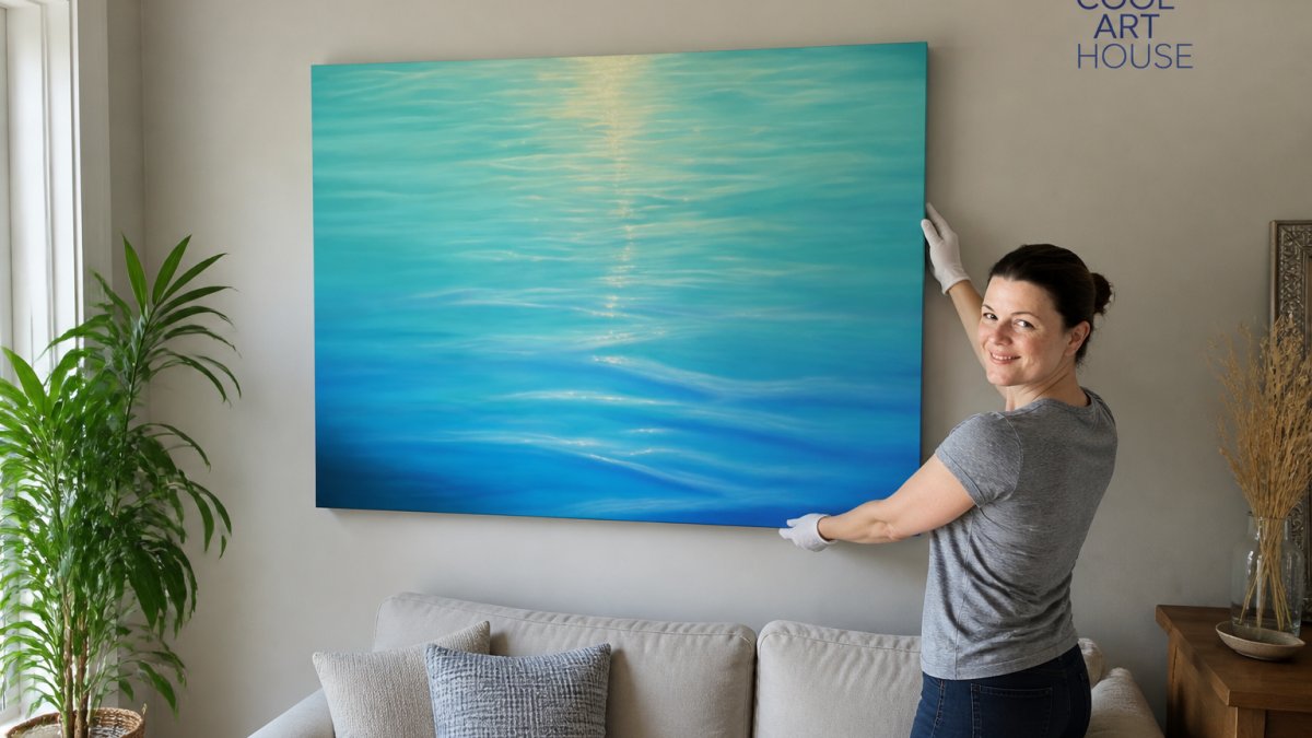
A stretched canvas print wraps the image around a wooden frame, so it arrives ready to hang with no glass and no glare, which matters in a living room with big windows.
- Appearance: matte, textured, slightly painterly. Colors read softer than on paper.
- Durability: good indoors. The canvas itself resists minor scuffs, but the surface can be dented by sharp objects.
- Maintenance: dust with a dry, soft cloth or a clean dry paintbrush. Never use a wet cloth, moisture can distort the canvas.
Framed paper prints: sharper, more formal
A paper print behind glass gives you the crispest color and sharpest detail of any format. It suits formal living rooms and lets you match a frame to existing trim or furniture.
- Appearance: sharp, saturated, reflective unless you choose anti-glare glass.
- Durability: the print itself is well protected, but glass can break and paper can fade if hung in direct sun.
- Maintenance: dust the frame and glass with a dry cloth. Clean glass with a barely damp cloth, never spraying directly on the surface.
Unframed vs. floating frame on canvas
Framing changes the feel of a canvas more than most people expect.
- Unframed stretched canvas: modern, casual, lightweight. The image wraps around the sides, so the art reads as a single object. Suits renters and relaxed spaces.
- Floating frame: a thin frame sits slightly away from the canvas, leaving a visible gap. This adds a finished edge and works well in more formal rooms. A black floating frame reads graphic and modern; a natural wood floating frame reads warmer and more coastal.
Canvas vs. paper vs. metal vs. acrylic at a glance
| Material | Look | Durability indoors | Maintenance | Living-room fit |
|---|---|---|---|---|
| Stretched canvas | Matte, textured | High | Dry dust only | Almost any living room |
| Framed paper | Sharp, glossy | Medium (glass) | Dry dust, careful glass cleaning | Formal rooms, low-sun walls |
| Metal print | Glossy, vivid, modern | Very high | Damp cloth safe | Contemporary, high-traffic rooms |
| Acrylic print | Glossy, deep color | High (can scratch) | Dry or barely damp cloth | Modern rooms, bright color schemes |
What to check before you buy
- Return policy: a 30-day money-back guarantee lets you test the piece on your wall without risk.
Once you have chosen the material, the next step is sizing and placement, the two numbers that decide whether the piece looks intentional.
How to Hang Canvas Art: Sizing and Placement for Living Rooms
How to hang canvas art comes down to two numbers: the width of your furniture and the height of your eye line.
The most common rule is to keep the art between 50% and 75% of the width of the sofa or sideboard below it. For height, the center of the artwork should sit at roughly eye level, about 145 to 150 centimeters from the floor.
Sizing by Wall: Sofa, Fireplace, and Open-Plan Spaces
Different walls call for different sizes:
| Wall Type | Recommended Width | Placement Tip |
|---|---|---|
| Above a sofa | 50-75% of sofa width | Center on the sofa, not the wall |
| Above a fireplace | Match the mantel width | Keep at least 15 cm above the mantel |
| Open-plan space | One large or panoramic piece | Anchor the seating zone |
| Narrow or rented wall | Single medium canvas | Center at eye level |
For open-plan rooms, one large-format or panoramic piece usually works better than several small prints scattered across a long wall.
Coastal Gallery Wall Layout: Multi-Piece and Panoramic Sets
A coastal gallery wall layout builds a bigger statement from smaller pieces.
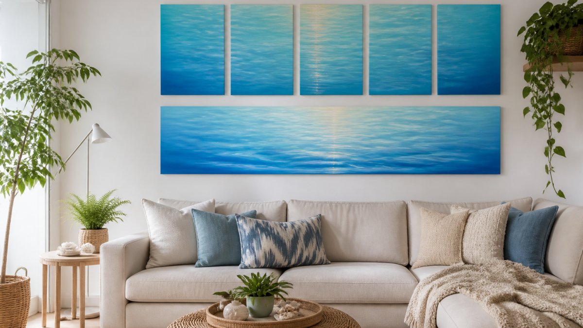
Plan the layout on the floor first, using paper templates or the actual pieces. Keep the gaps between frames consistent, usually 5 to 8 centimeters. A common approach is a large centerpiece with smaller prints balanced around it.
Color Palettes: Matching Ocean Wall Art to Your Existing Decor
Most guides stop at "blues and whites go with everything." The real skill is reading the colors already in your room, wall paint, sofa fabric, wood tones, metal finishes, and accent pieces, and choosing a seascape that echoes at least two of them.
Here is how to do that room by room.
Step 1: Identify your room's base temperature
Look at your wall paint and largest upholstered piece. Warm rooms lean toward cream, beige, taupe, greige, warm grey, or wood with a honey undertone. Cool rooms lean toward pure white, cool grey, blue-grey, or wood with a grey undertone.
- Warm room: choose ocean art with sand, gold, peach, or sunset tones. A beach sunrise or a warm-toned shoreline scene will feel native to the space.
- Cool room: choose ocean art dominated by deep blue, slate, sea-glass green, or stormy grey. A moody wave or open-water horizon will feel intentional rather than pasted on.
- Mixed room (warm walls, cool sofa, or vice versa): pick art that contains both temperatures, for example a seascape with a cool blue sea and a warm sand foreground. The art becomes the bridge.
Step 2: Match the art to your wood and metal tones
Wood and metal are the two finishes people forget, and they usually make a piece of art look "off."
- Light oak, ash, or birch: pair with pale seascapes, soft blue water, and white foam. Dark, heavy wave prints will overpower light wood.
- Walnut, teak, or mahogany: pair with deep navy, teal, or dramatic storm scenes. The art needs enough visual weight to sit alongside rich wood.
- Black or brass metal accents: black frames and dark-toned seascapes feel cohesive with black hardware; brass and gold hardware pair naturally with warm sunset or golden-hour ocean prints.
Step 3: Use one accent color as the anchor
If your living room already has a strong accent, a mustard cushion, a terracotta rug, a sage throw, do not fight it.
The rule of thumb most interior stylists use: the art should share at least two colors with the room, and introduce no more than one new color. If it shares three or more, it will look like it was made for the space.
Step 4: Match the art to your wall paint
- White or off-white walls: almost any ocean palette works. Use this as your chance to add the strongest color in the room.
- Warm beige, taupe, or greige walls: avoid art that is mostly cool grey. Lean into sand, cream, and warm blue.
- Cool grey or blue-grey walls: avoid art that is mostly warm orange or yellow. Lean into navy, slate, and sea-glass green.
Quick reference: room palette to ocean art pairing
| Your room's dominant palette | Best ocean art direction | Avoid |
|---|---|---|
| Cream walls, light oak, linen sofa | Pale blue water, white foam, soft sand | Heavy black-and-white storm scenes |
| White walls, grey sofa, brass accents | Golden-hour seascape, warm sunset | Cool slate or steel-blue prints |
| Grey walls, walnut furniture, black hardware | Deep navy, moody waves, stormy horizon | Pastel or washed-out beach scenes |
| Sage walls, natural wood, terracotta accents | Sea-glass green, muted teal, sand foreground | Bright turquoise or neon blue |
| Navy feature wall, white trim, chrome | White-foam wave, pale sunrise, high-contrast horizon | Dark, low-contrast seascapes |
Once the palette is right, the next decision is what the art is printed on, a choice that affects how the colors read in your room.
Styling Ocean Wall Art for Renters, Airbnb Hosts, and Offices
Renters and hosts share one problem: they need art that looks good, ships fast, and requires no permanent commitment. A stretched canvas print solves most of that, it arrives ready to hang, needs no framing, and moves with you when the lease ends.
For Airbnb and short-term rental hosts, calming coastal art helps guests relax and photographs well in listing images; neutral seascapes suit almost any guest.
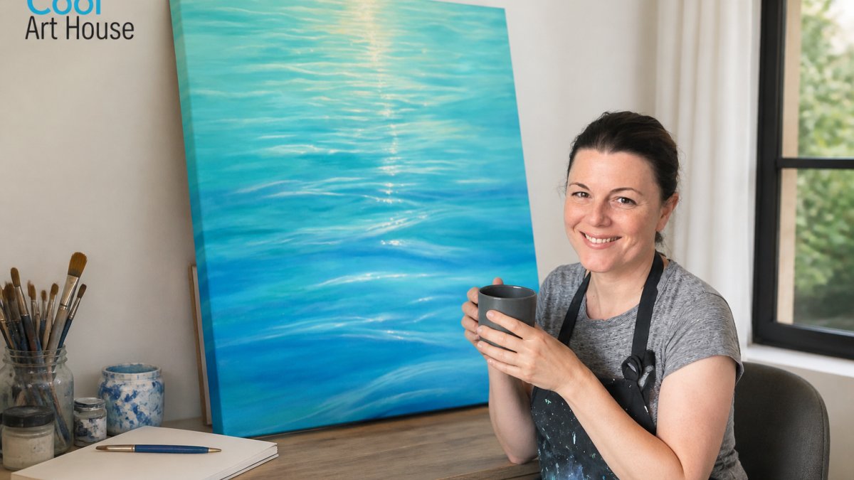
This is where our own approach helps. Cool Art House offers print-on-demand stretched canvas prints of De Camille's original Ocean Bliss seascape artwork, made to order close to you so shipping and tax stay within your country. Every piece ships worldwide, arrives ready to hang, and is backed by a 30-day money back guarantee. Browse the full range.

Conclusion: Bringing the Calm of the Ocean Home
Choosing art for a living room should feel calming, not stressful. Pick a style that matches your light, size it to your furniture, and let the colors echo what is already there. If you want a seascape that arrives ready to hang and ships to your door, explore the Ocean Bliss collection from Cool Art House. Each print is made to order, backed by a 30-day money back guarantee, and designed to help your living room feel serene.

Frequently Asked Questions
How do you style ocean wall art in a living room?
Start with one large piece or a multi-piece set as the focal point above your sofa, then keep surrounding decor simple so the artwork stands out. Choose sand tones, sea glass accents, and calming neutrals to echo the ocean palette. For a relaxed coastal look, pair stretched canvas prints with natural textures like linen, rattan, and light wood. A single panoramic seascape can anchor an open-plan space, while a small gallery wall of three to five pieces works well on narrower walls.
What size canvas should I choose for a living room wall?
As a rule of thumb, artwork should span about two-thirds of the width of the furniture below it, such as a sofa or console. For a typical three-seat sofa, that means a large-format canvas around 120 to 150 cm wide, or a multi-piece set that fills the same span. Small prints can look lost on a large wall, so measure your space first. Cool Art House canvas prints are available in a range of sizes, and the Ocean Bliss series works well as a single statement piece or grouped set.
Does ocean-themed art work with modern living room decor?
Yes. Modern interiors often use clean lines and neutral tones, which let a seascape or wave study add color and calm without clashing. Choose artwork with a limited palette, such as blues, whites, and soft greys, to keep the look contemporary. A stretched canvas print without a heavy frame suits minimalist spaces, while a black floating frame adds definition in more structured rooms. The Ocean Bliss series, with its sunlit water reflections, fits both approaches.
How can I create a coastal gallery wall without damaging rental walls?
Lay your pieces out on the floor first to find a balanced arrangement, then use removable adhesive hooks or picture-hanging strips rated for the weight of stretched canvas prints. Keep spacing consistent, usually 5 to 8 cm between frames, and align the centre of the arrangement at eye level, around 145 cm from the floor. Lightweight canvas prints are ideal for renters because they need only one or two hooks each. Cool Art House prints arrive ready to hang, which keeps installation simple.

Leave a comment
This site is protected by hCaptcha and the hCaptcha Privacy Policy and Terms of Service apply.